All Channels
Approvals 5/3 ▼
C_Menz (2) - 4445d ago Cancel
BeastOrange (2) - 4445d ago Cancel
gizmig (1) - 4445d ago Cancel
730°

Windows 8 operating system introduces new logo design

Windows Blog: We have said that Windows 8 is a complete reimagination of the Windows operating system. Nothing has been left unexplored, including the Windows logo, to evaluate how it held up to modern PC sensibilities. The Windows logo is a strong and widely recognized mark but when we stepped back and analyzed it, we realized an evolution of our logo would better reflect our Metro style design principles and we also felt there was an opportunity to reconnect with some of the powerful characteristics of previous incarnations.

Read Full Story >>
windowsteamblog.com
Create Report !X

Add Report

Reports

+ Updates (1)- Updates (1)

Updates

Changed from Pending to Approved
Community4445d ago
Fadetoblack694444d ago

Rotate the new logo 90 degrees to the left and it looks like Windows 8 going into the recycle bin hahah

This new logo is so boring I thought this article was a joke....

Solid_Malone4444d ago

yeah the logo looks pretty terrible

Patriots_Pride4444d ago

Because a bitten Apple and a Green Robot is so innovative and awesome.

Bounkass4444d ago

Looks stupid to me... Are they saving money on 3D designers too?

Speed-Racer4444d ago

:/ A 5 year old could have designed that. For a system that is so good, they cheaped out in the design department.

somekindofmike4444d ago

they hired one of the most respected design agencies in the world, it wasn't a case of "cheaped out" I'm sure they paid top dollar for this.

Even so, it is very meh...

Hozi4444d ago

LOL....MS has all the money in the world so they hire a top design company to design something my 8 year old nephew could do....I guess when the money keeps pouring in you can spend it however wildly you want.

Speed-Racer4444d ago

SO it's a 6 year old. Jk...but seriously, that is a waste of money. Might be minimalist, but it doesn't have that striking effect. Maybe if they used a color scheme rather than one color, or asymmetric shapes.

C_Menz4444d ago

What's wrong with the Windows 7 logo? Looks a lot better than this Windows 8 logo to me.

Show all comments (17)
60°

Microsoft OneDrive Is Ditching Windows 7, 8, and 8.1

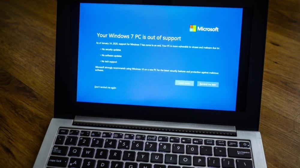
The cloud storage platform will drop support for older versions of Windows in early 2022.

Create Report !X

Add Report

Reports

+ Updates (2)- Updates (2)

Updates

Changed from Pending to Approved
Community893d ago
Changed: title, content, url
Christopher893d ago
110°

Former Windows chief reveals Microsoft’s reaction to the iPad

Microsoft responded with Windows 8 and its Surface RT tablet.

Read Full Story >>
theverge.com
Create Report !X

Add Report

Reports

+ Updates (1)- Updates (1)

Updates

Changed from Pending to Approved
Community1543d ago
50°

Microsoft’s Panos Panay discusses the past and future of Surface

In the earliest days of the Surface, it was hard to shake the notion that the line was something of a reference design for Windows 8.

Read Full Story >>
techcrunch.com
Create Report !X

Add Report

Reports

+ Updates (1)- Updates (1)

Updates

Changed from Pending to Approved
Community2375d ago