
The Next Web: iOS 7 is beautiful. It's exciting. It feels like a completely different phone—vibrant, alive and a design refresh in the truest sense of the world. But, um, what about them app icons? Some are nice but most are bizarre looking and possibly even ugly. How can something look so good inside but so weird on the face?
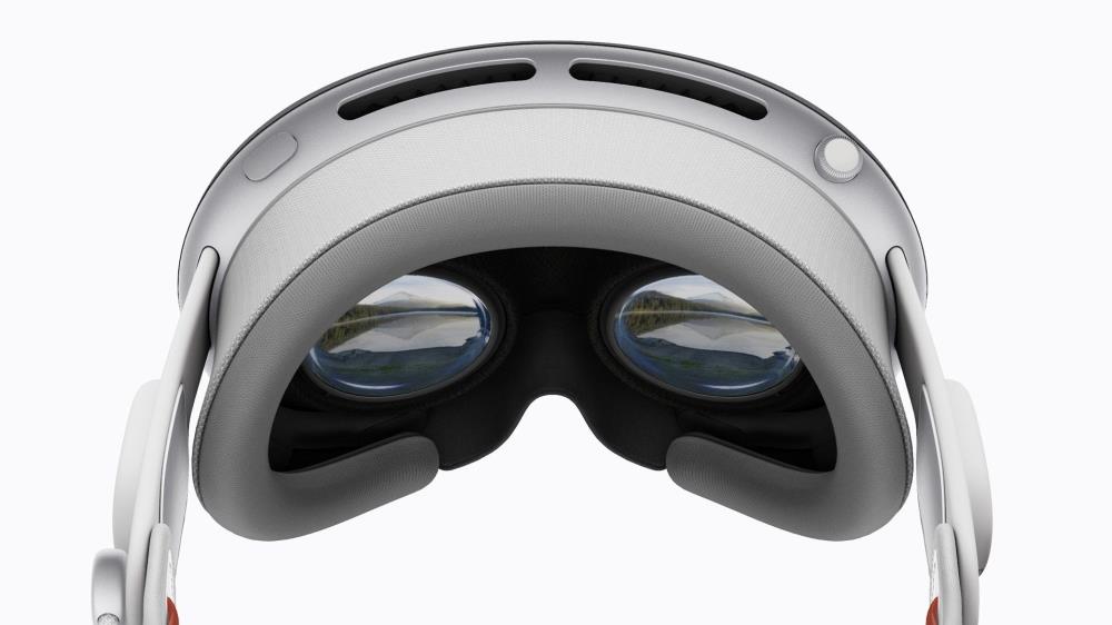
Vision Pro is here and it’s a surprisingly capable device. Apple has also loaded the headset with a ton of options and features that aren’t obvious at first glance.
Ringing the changes: All the news, rumors, and tips you missed last week.
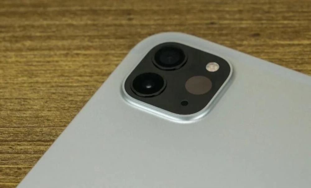
Apple is anticipated to announce the new OLED iPad Pro this spring. Although there has been considerable speculation about the product, it’s always reassuring when Apple officially confirms certain features through upcoming software updates.

I've fixed the images on some of these past submissions of yours. Please in the future make sure the image isn't broken on submission.( I always found it best to download/upload it to be honest. )


because apple has been getting flac for having the same interface for the last 6 years and it was time to "freshen it up".